Complacency over Coal’s Collapse: Five Factors to Consider

American coal companies’ stock prices have crashed in recent years, in response to the triple-whammy punch that is the US fracking boom, the environmentalist movement, and the slowdown in the Chinese industrial economy. As recently as January of 2016, the Dow Jones US Coal Index had lost around 92 percent of its market value since mid-2014, more than 97 percent of its value since 2011, and more than 98 percent of its value since its all-time peak in 2008.

Coal stock index 10 Year
2008 highs over 700, 2011 highs at 500, 2014 highs around 150, 2016 lows at 12, today at 33.87

Now, it may be that coal really is finished as a major industry in the US, but there is no reason to be certain about this. The market’s plunge is arguably more a sign of investor panic than of rational valuation: coal still accounts for around a third of US electricity generation and close to 40 percent of electricity generation worldwide. The economic outlook for the coal industry does not seem to have collapsed to the extent the Dow Jones US Coal index might suggest.

US_electricity_generation_by_source.png
Energy mix in the US

world electricity production

1. Climate Change 

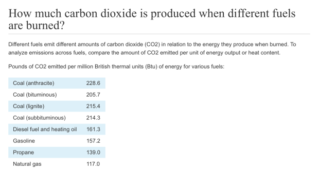
Burning coal is generally considered to be around twice as carb0n-intensive as burning natural gas. Carbon dioxide, however, is hardly the only culprit where climate change is concerned. Methane emissions are also a crucial component to climate change, for example, and industries like natural gas and meat production can be more methane-intensive than coal.

112815_cowchart_rev
US Methane Emissions By Source

Thus far the natural gas industry, food industry, and many in the US government have neatly sidestepped the methane issue, refocusing American public attention toward carbon dioxide. They have done this by using the “we need to protect the planet for the sake of our grandchildren and future generations” approach. Methane emissions, after all,  only contribute directly to global warming for a few years or decades at a time, whereas carbon dioxide can remain in the atmosphere for many centuries.

The truth, though, is probably that this is deliberately misleading. Future generations may be perfectly capable of handling whatever climate change comes their way, or of removing carbon dioxide from the atmosphere. The really dicey climate change period is more likely to occur within the coming years or decades, when the world is not yet technologically advanced enough to protect vulnerable human (and animal) populations. Within such a time frame, emissions of gasses like methane can be even more impactful than carbon dioxide.

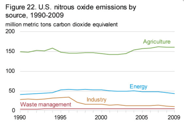
Today US methane emissions, measured in kilotons of CO2 (carbon dioxide) equivalent, are around ten percent as high as carbon dioxide emissions. Since the impact of each kt equivalent of methane upon global warming can be up to 80-90 times higher than carbon over the course of a twenty-year period, however, the overall effect of methane emissions can perhaps be worse for climate change than carbon emissions can.

Indeed, while the direct impact of methane fades over time, the indirect impact of methane emissions could remain for decades if they help to trigger a global warming feedback loop; for example, if it helps to cause sun-reflecting polar ice to melt, which could warm the planet and so cause even more polar ice to melt.

methane emissions

Carbon Emissions.png
Carbon dioxide emissions by country, in 2013. Admittedly, given the speed of America’s shale energy boom in recent years, it is possible that these numbers from two and a half years ago are already outdated to some extent

Thus, methane emissions arguably deserve more public attention and regulation. And if they are regulated, it may weaken the natural gas industry relative to the coal industry, as the gas industry in the US accounts for almost triple the methane emissions that coal does. Just this month, the US federal government has launched its first ever package of methane emission regulations for the oil and gas sector.

nitrous oxide emissions.png
Another greenhouse gas to consider in nitrous oxide. Nitrous oxide emissions in the US are roughly 5% of carbon dioxide emissions, measured in kilotons. They only last in the atmosphere for 114 years on average. According to the EPA, though, “The impact of 1 pound of N2O on warming the atmosphere is almost 300 times that of 1 pound of carbon dioxide.” As with methane, it is agriculture, not coal, that is the main culprit of nitrous oxide emissions. Even most of the nitrous oxide emissions that come from the “Energy” sector labelled on this graph come from cars and trucks, rather than from coal-fired power plants.

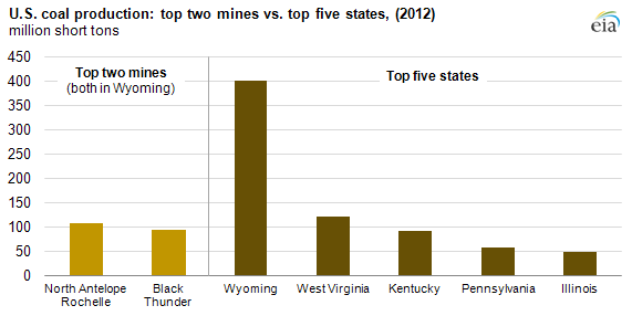
Methane, which is the main component of natural gas, can also be captured and then stored or used to produce energy. Capturing methane from the natural gas industry, however, is extremely difficult to do, because the gas sector is diffuse, consisting of hundreds of thousands of wells spread across dozens of states as well as in offshore fields in the Gulf of Mexico. Capturing and making use of methane that is released from coal mines could perhaps be easier to do, since coal production is more concentrated than gas or oil. There are only about 1000 or so coal mines in the country, and they are located mostly in Wyoming or the Midwest.

toptwo

Another thing to note is that while burning natural gas is only a bit more than half as carbon-intensive as coal, much of the natural gas production in the United States comes  as a byproduct of drillers trying to produce oil. This means that US gas is actually more carbon-intensive than it seems, since it would not be produced as much if the US was not also producing so much oil, and oil (or gasoline) is more than three-quarters as carbon-intensive as coal is.

gas as byproduct of oil
http://www.etf.com/sections/features-and-news/5339-natural-gas-now-a-byproduct-of-oil-drilling-output-to-climb-as-long-as-oil-prices-stay-high
eia co2
Most coal in the US is bituminous or sub-bituminous

This also raises the question: will the price of oil in the US remain low? If it does, it is likely to result not only in a reduction in oil production, but also in natural gas production (again, because natural gas is frequently a byproduct of oil), which in turn could cause coal to become more competitive relative to natural gas.

Oil in the US is used mainly for transportation, so it is possible that the revolutions now taking place in the transportation sector – for example, Uber (and companies like Uber), UberPool, Zipcar, electric vehicles, hybrids,  e-commuting and e-commerce, using smartphone apps to make express busses finally become feasible, being able to watch a movie or do work on your smartphone or tablet while you are taking public transit or being carpooled,  and the development of self-driving vehicles  – could lead to such a reduction in oil use.

In the case of electric or hybrid vehicles, this could also lead to a major increase in electricity usage, potentially helping the coal industry at the expense of the oil and gas industry. And while electric cars may not soon be appearing in every driveway, it may not be too long before a widespread network of electric or hybrid Uber-esque vehicles and Zipcar-esque vehicles come into place.

If, moreover, self-driving vehicles do become a reality as well at some point, it could make vehicle-sharing services like Uber and Zipcar even more competitive, and could allow electric Uber vehicles and Zipcars to drive themselves to (and wait in line at) the nearest battery-charging station. This is an important factor, given that fully charging an electric vehicle often takes several hours.

Of course, many people think that coal is likely to lose out not only to natural gas, but also to alternatives like solar energy, which emit relatively little carbon dioxide, methane, or any other type of greenhouse gas. However, it is still not clear when or if industries like solar will be able to compete on a large scale with coal in developed economies like the United States.

Much has been made about the falling cost of solar panels They are often said to have become more competitive as a result of technological improvements, and are expected to continue doing so going forward. In fact there is an alternative plausible explanation about what has driven the falling cost of solar panels: government support in East Asia (especially China), Europe, and to a lesser extent North America. The solar industry may have benefited from attempts by governments in these regions to stimulate their slowing industrial sectors and reduce pollution at the same time.

solar panel
above: China’s solar panel statistics, 2004-2012

solar.png

If this explanation is true, then it is possible that the cost of solar panels going forward will not continue to fall as much as people now expect them to. Indeed, if China’s economy has the “hard landing” some fear it will, panel prices could even rise a lot as solar panel manufacturing output collapses.

Ultimately, though, climate change threats will continue to hamper the coal industry, unless at least one of two things happen. The first is large-scale carbon capture and storage. Though carbon capture and storage has been over-hyped in recent years , it cannot be ruled out entirely either. We will discuss this further below.

The second is climate change fatalism. If it becomes accepted that we already well past the point of being able to reverse global warming, then the priority could shift away from reducing carbon emissions and instead become achieving rapid economic advances in order to pay for the huge, global effort that adapting to climate change will entail. Ironically, coal could be employed as the cheap, plentiful resource used to spur such rapid economic growth. If this sounds a bit crazy, bear in mind that it is the approach that India and China are already implicitly (and at times explicitly) embracing at the moment. India in particular is still planning on building many new coal plants in an attempt to achieve economic growth.

Bangladesh, perhaps the most climate endangered among the world’s hugely populous nations, has resisted climate change fatalism. However if it runs out of hope that the world’s major economies will take the necessary measures to mitigate climate change, then it could end up getting on board with this philosophy too, since it desperately needs economic growth to lift its population out of the immediate poverty it faces.

Countries like Bangladesh have, in addition, been publicly toying with the unorthodox idea of purposely releasing gasses like sulphur dioxide into the atmosphere in order to deflect sunlight and thus reduce global temperatures. Indeed, certain industries already produce this effect over a limited timespan, due to the sulphur dioxide they emit. Such industries include coal-fired power plants and container shipping.

According to this article from the Guardian, the container shipping industry alone, over a five-year lifespan, may contribute a cooling effect significant enough to offset the warming caused by every car, bus, and airplane in the world combined. Still, this cooling effect diminishes over longer timespans as sulphur dioxide leaves the atmosphere, and, in any event, sulphur dioxide emissions also cause significant local pollution, such as acid rain.

2. Local Pollution

A lot of the most concerted pushback against coal has seemed like it is driven by fears of climate change, when really it is driven to a substantial extent by frustration with more local forms of pollution that the coal industry creates. In order for local anti-pollution activists to gain public support, they often, quite understandably, use climate change as a cover.

The threat of climate change alone, without local anti-pollution activism, has a more difficult time of creating meaningful pushback, because climate change is far less of an immediate and concentrated danger than localized pollution is. Pushback against local pollution, for example, historically played a significant role in causing American industry to outsource to places like China that were more willing to tolerate it. This is also, by the way, one reason why methane emissions have gotten off the hook compared to some other types of greenhouse gasses, including carbon dioxide: methane causes far less local pollution, even though its contribution to global climate change can be severe.

If coal can overcome its local pollution problem, then, it may be able to revive itself to some extent even in spite of the role it plays in global climate change.

There is a way that the coal industry may reduce its local pollution problem: disassemble and reassemble coal-fired power plants and relocate them to more sparsely populated areas, and largely mechanize the operation of coal-fired power plants and coal mining sites.

CoalRetirementsMap
The West is wide open
pop dens
US population density/major city map

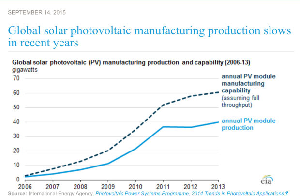
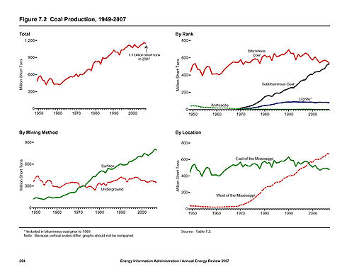
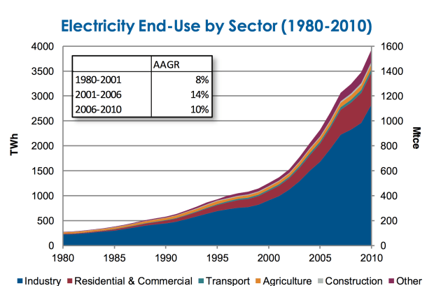
The mechanization of the coal industry is already well on its way (see graph below) and will probably continue in the coming years as a result of the “robot revolution”. Moving coal-fired plants to less populated areas would of course be enormously expensive; it would require not just moving the plants themselves, but also the building of new electricity lines.

WV_Employment_vs_Production

Finding cheap routes to build electricity networks through is no easy task, nor is maintaining such electricity networks once they are already built. Plus, the longer the route, the more electricity is lost in transmission – and the routes would have to be quite long in order to locate the power plants in sparsely populated areas. Still, it could happen, if coal can remain cost competitive with other energy sources. More on this in the next section.

Local pollution is also a major reason why urban and suburban areas may start to use a lot of hybrid, electric, or Uberpool-esque vehicles, since conventional gasoline-powered vehicles create a lot of air pollution (and noise pollution) in areas in which lots of people live. Hybrids, if they can become cost-competitive with conventional cars, are ideal in this regard, as they typically cause air pollution only on rural or ex-urban roads where fewer people live.

If electric vehicles become common, it could boost demand for electricity (helping coal, potentially) and decrease demand for oil (helping coal by causing less natural gas production, potentially).

Finally, local pollution is most harmful in places where there are lots of physically vulnerable people; i.e. in densely populated countries where there are many young kids or senior citizens. The United States does not fit this description, as it is sparsely populated and most of its population is in the prime of their lives. The developing world, on the other hand, is often very young and densely populated, while Western Europe, Japan, and increasingly even China are old and densely populated. Pushback against local pollution in China in particular could cause some industrial activity – and its attendant demand for electricity – to relocate to North America.

land per capita
The countries that are by far the most densely populated on this list, namely India and Japan, have by far the youngest and oldest populations, respectively, among the world’s major economies.

3. Robots 

Robots could benefit the coal industry in multiple ways. First and most obviously, they are likely to cause American electricity demand to soar, because robots are often extremely energy-intensive to use and because they could lead manufacturing that in previous decades has been outsourced to countries like China and Mexico to be brought back to the United States.

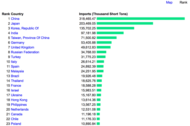
The same is true in other developed economies, like  Japan, South Korea, Taiwan, and Hong Kong, which are already totally reliant upon coal and other fossil fuel imports to power their economies. In 2014, Japan and especially South Korea were the biggest purchasers of US coal, with the exception of the Netherlands (a European trade hub), Britain, and Brazil. East Asia is also the primary destination for more than three-quarters of Canadian exports of coal, which are split about equally between China, Japan, and South Korea.

coal imports
World’s largest coal importers. Source: Index Mundi

Indeed it seems like ancient history now, but prior to United States sanctions on Japan in the 1930s, Japan was getting around 60-80 percent of its oil imports from the United States. It is not totally out of the question that a somewhat similar pattern could re-emerge, with the US exporting fossil fuels to East Asia once again, as the US may want each of these countries to remain strong enough to “contain” China.

relative trade northeast asia
These values adjusted for GDP size; they are not given in absolute terms. In absolute terms, China and Japan would be higher than South Korea and Taiwan in every case. Source: Future Economics

South Korea and Taiwan are particularly dependent upon energy imports (see graph above). And the United States is very approving of its alliances with these two countries because they help to “counterbalance” (to use another geopolitical euphemism) both China and Japan, which by most accounts remain by far the world’s second and third largest economies.

fossil fuel importers

For Japan, robots could particularly cause electricity demand to surge, given that Japan may need to use a lot of them to replace its rapidly aging, high income labour force. Japan’s other alternative thus far has been to outsource labour to countries like China and Thailand, however it is not clear how much Japan is willing to continue becoming dependent on these countries, and meanwhile millions of Japan’s domestic workers are approaching retirement age.

population-pyramid-of-japan-in-2015

A second way robots could help the coal industry is by causing electricity demand to rise overnight. One of the drawbacks of coal power has been that coal-fired power plants, unlike hydroelectric dams or, to a lesser extent, compared to natural gas plants, cannot easily ramp up and down their electricity production. This has meant that, like nuclear plants, they tend to over-produce electricity overnight, when the cost of producing the power is often higher than the price it sells for. However, since robots don’t sleep, they may drive up the demand for electricity at night. In addition to coal and nuclear, this may also help wind power, since it is often windier overnight than during the day. But it could hurt solar power.

Robots could perhaps also help allow coal-fired power plants to be moved to or built in sparsely populated areas where their local pollution will not be as bothersome, since robot-run factories may not need to employ many humans. This could also prevent new, long electricity lines from having to be built and maintained in some cases, as the power plant could be located right next to the robot-run industrial areas.

Robot-run factories and coal-fired power plants could also be constructed next to or near the coal mines themselves. This could be a big help to the industry, as coal has very high transportation costs because of how bulky coal is compared to other resources, for example oil, and because coal cannot be moved by pipeline. (Moreover, the transportation of coal often creates significant pollution next to the railways, roads, or barges it is being carried on).

energy density
Note: coal may be a lot less energy-dense than natural gas in gravimetric terms, as shown above, but not in volumetric terms: natural gas takes up a lot of space, since it is a gas

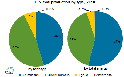
Lignite, in fact, which is used commonly in Europe, has such a low bulk-to-value ratio that in most cases it transported only extremely short distances, and often by conveyer belt. A lot of sub-bituminous coal, which is very common in the US, is not much more dense in its energy content.

coalprodprice.pngcoalpiesp2

Given this bulkiness, coal could also benefit from robots that aid in the transportation sector: namely from self-driving trucks. Coal is often mined in mountainous areas, where building railways is difficult and expensive (railways cannot handle inclines or sharp bends easily, compared to roads). Building railroads to reach mines, or trucking the coal to the nearest railroad, can be an enormous expense. In the US and Canada coal mining also occurs in wintry and relatively remote locations, for example in northern Alberta or in the mountains of Montana and Wyoming, which can cause transport costs to be higher still.

rail on trains.png

With self-driving trucks, however, you do not need to pay a driver wages or insure a driver against the event of injury in a mountain-road accident, which saves money, and self-driving trucks can work all night, which improves efficiency. In fact, even large trucks are often too large to use on mountain roads and tunnels (or if there are mountain roads capable of handling them, they are often very expensive to build and maintain), but with self-driving trucks it is possible to use small trucks instead because you don’t have to worry about paying drivers’ wages or insurance. It would otherwise take a lot more drivers to transport coal via small trucks compared to large trucks, since small trucks can carry much less coal per trip.

USA---Energy---Mountainto-008
Welch, West Virginia

Self-driving trucks could be a huge boon for the coal industry, then. Indeed, because many mining roads are privately owned by mining companies, they may be able to begin using self-driving trucks before normal roads do, since the biggest barrier to adopting self-driving trucks elsewhere may be public regulations.

Finally, robots and computer systems could help in the maintenance of long power lines, which could benefit the coal industry a great deal (and also benefit other industries, like wind power). Current methods of doing this are expensive, unwieldy, and often dangerous. This video may seem outdated, but many of the methods it shows are frequently still used today.

Strip_coal_mining
Surface Mining, common in Wyoming

topten

And of course, there may also be plenty of opportunities for robots to increase efficiency in the actual mining of coal itself.

coal reserves by country.png
America dominates in the most important category, “Anthracite and Bituminous” coal. Some of its main competitors, notably Russia and Australia, have their coal reserves located in extremely remote parts of the planet. Germany and Greece, meanwhile, antagonists of one another in the “Eurocrisis”, have something in common: they are rich in lignite but poor in coal. Germany gets around 25 percent of its electricity from lignite production and another 18 percent from coal. 
500px-Fig_7-2_Coal_Production
US Coal production: much has moved from east of the Mississippi River to west of the Mississippi, from underground mining to surface mining, and from bituminous coal to sub-bituminous coal

coal vs gas price .png

4. Developing Economies 

Many developing nations have embraced coal because it is cheap, but this process could slow or even reverse in the future. If it does, it could allow the US to pick up some of the coal slack that developing countries give up, since there is only so much carbon that the world can handle, and since in some cases it could lead manufacturing to relocate to the US. It could also cause the developing world to import more LNG or renewable energy sources from the US, pushing up the cost of those energies in the US when compared to coal.

First, as climate change fears rise, developing countries could begin to have to scale back on coal, whether because their own populations become worried (the developing world in general is more vulnerable to climate change than the developed world is) or because the developed world decides to slap carbon tariffs on their exports.

Second, local pollution in much of the developing world has become so intense that it may cause – and in some cases, is already causing – increasing pushback against coal.

Third, as was mentioned earlier in the article, robots could allow developed countries to “reverse outsource” their manufacturing industries, which would sharply reduce demand for energy in the developing world.

china electricity.png
Electricity use in China is dominated by the industrial sector

Fourth, if urbanization slows in the developing world – which it could, because of such “reverse outsourcing” taking away urban jobs, because of the spread of cell phone and Internet access into rural areas, because of urban air pollution becoming intense and undesirable, and because urban temperatures in developing countries are frequently extremely high compared to rural areas (particularly rural highlands) – then the developing world will demand energy sources that can be accessed in rural areas where there are little or no electricity grids: solar panels, diesel generators, small wind turbines, etcetera. But not coal, which is generally burned in big power plants to power cities and factories.

coal by country

Instability in the developing world might also benefit the US coal industry, allowing the US to increase its coal exports. If, for example, China falls into regional chaos like it did for decades prior to the Communist takeover of the country in the late 1940s, then it could put at risk some or many of the energy supply routes that link China’s energy-rich interior provinces (like Shanxi, Heilongjiang, and the “autonomous regions” of Xinjiang and Inner Mongolia) to China’s major urban areas on the coast (like Shanghai, Guangzhou, Hong Kong, Beijing-Tianjin, Taipei in Taiwan, and many  others).

coal consumption china.png
Coal Mining by Province
china coal plants .png
Coal-fired power plants map — the region around Shanghai, which does not mine much coal itself (see map above) dominates

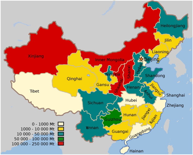
Shanxi and Inner Mongolia combined have accounted for more than 15 percent of global coal production in recent years. If China’s coastal cities cannot secure energy supplies from within China, they may turn to importing coal from countries like Australia and even the US instead. This may not be likely to happen, but it is a “black swan” possibility that is worth taking note of, given China’s historical regionalism and the enormous energy and coal consumption of China’s coastal provinces.

This is also true of other energy sources. China’s natural gas, hydro, and most of its oil production, for example, are also located in interior provinces like Heilongjiang, Xinjiang, Sichuan, and Yunnan. They are in fact often located extremely far in the interior, such as in the Autonomous Region of Xinjiang, which produces a substantial portion China’s oil, natural gas, and coal.

Xinjiang has a deep ethno-religious divide between Turkic Muslim Uyghers and its more recent Han Chinese settlers, and has very difficult terrain that has historically made it prone to separatism, irredentism (with the Turkic Muslim populations of neighbouring, now-independent Central Asia) and “warlordism”. In Xinjiang, mountains cover an area larger than England and regularly reach heights higher than the highest Rockies. Much of Xinjiang is also covered by deserts or semi-deserts, and the region is so far inland that its capital city, Uruqmi, “has earned a place in the Guinness Book of Records as the most remote city from any sea in the world. It is about 2,500 kilometres (1,600 mi) from the nearest coastline”.

china gas provinces.png

china oil by province
China is the world’s fourth largest oil producer, trailing only Saudi Arabia, the United States, and Russia
china pipelines
China’s natural gas network is not extensive like the United States’ is. If a single line were to be endangered as a result of political unrest – for example, the connection to the cities of Guangzhou and Hong Kong, where much of China’s economic activity is located – China might have to look to imports of energy from abroad to make up the difference. This map comes from the US Energy Information Agency 
ngpipelines_map
Natural gas pipelines in the US

China has, similarly, also pinned hydro hopes on Tibet; a risky proposition given its intensely difficult terrain, remoteness, ethno-religious resistance to Chinese settlement and domination, and position as the source of most of India’s, China’s, and Southeast Asia’s live-giving rivers.

China’s energy imports come mostly, however, from Siberia, Central Asia, or from Oceania, Africa, or most often the Middle East (by way of the Strait of Hormuz, the Indian Ocean, the Strait of Malacca, and South China Sea). Should these supply routes be imperilled, Chinese coastal cities could be forced to import energy across the Pacific from the Americas instead.

indian-ocean-bases

13 percent of China’s oil imports comes from Angola, even, according to the US Energy Information Agency, more than from any country apart from Saudi Arabia (16 percent). Angola, apart from being a formerly war-torn country that remains full of material poverty and ethnic division, is located very far away from China, on the Atlantic rather than Indian Ocean coast of the African continent. For its oil to reach China, it must first round the southern tip of Africa, passing waterways controlled by Angola’s regional rival South Africa.

india-map-coalreserves
A somewhat similar thing could happen, theoretically at least, in India, the world’s third largest coal producer and fourth largest coal importer. Much of the Indias’s oil and gas is produced or processed in states like Gujarat and Rajasthan, while most of its coal is produced in Jharkhand, Chhattisgarh, and Odisha, states which account for two-thirds of India’s coal reserves.
India_map_Naxal_Left-wing_violence_or_activity_affected_districts_2013
There is a close overlap between India’s Naxalite-Maoist insurgency and India’s coal producing regions. The exception is Assam-Maghalaya region, but this region, which is connected to the rest of the country by a narrow land bridge between Bangladesh, Nepal, and Bhutan, has its own set of severe problems and insurgencies. Finally, you’ve got the Telangana-Andhra Pradesh complication.

It may also become more economical to have solar power harnessed in the developing world more than or instead of in the developed world. This is because in the developing world, peak energy may increasingly occur at the same time as peak sunlight: in order to power air conditioning for billions of people when its 30-50+ degrees Celsius outside. In the developed world, in contrast, air conditioners are already widespread, and in many places peak energy use occurs when the sun is not bright, for example to power heating units in the winter, or to power perennially overcast places like Britain or Seattle, or to keep the lights on during super-long winter evenings in Scandinavia, or perhaps eventually to power electric cars overnight.

The developing world may also be increasingly likely to use airplanes more often than the developed world does. This is an important point, as airplanes arguably contribute to climate change  more than all the cars on the world’s roads combined (at least, over a five-year timespan), since they emit lots of greenhouse gasses at high altitudes. Developing countries may need to use airplanes more because much of the developing world is located in areas where land-based transport can be difficult: in mountainous or hilly areas, in deserts, in the Tropics, in archipelagos, in rural areas, in conflict-prone areas, and in densely populated cities with terrible traffic jams.

The developed world, on the other hand, may even replace its own airplane usage with land-based transport in some cases, as a result of the technological advances occurring within the land-based transportation sector. Instead of flying from New York City to Florida, Sydney to Melbourne, or even London to Barcelona, people may take the train or bus instead (making use of the wi-fi on the train or the bus along the way, as well as the ability to use services like Uber and Zipcar to get around once they have arrived at their destination) or eventually even take a self-driving vehicle.

5. War

During World War Two, inter-continental weapons did not exist, so US shores were safe from attack (with a few exceptions). During the Cold War inter-continental weapons did exist, but the US was saved from attack by its massive deterrent of nuclear and conventional weapons.

Today, however, precision “smart-bombs” and precision cyber-weapons exist, putting the US at risk (in theory, at least) of a surprise attack on its military and industrial infrastructure. Because a large-scale precision attack would cause very few deaths by WW2 or Cold War standards – a factory could in some cases be destroyed overnight and kill only the night watchman, while cyber-weapons can disable an entire electricity grid without killing anyone – it could mean that an enemy country could be more willing to take the risk of launching such an attack. In other words, the technological advances that are making war less deadly may also end up making war more likely to occur.

The Pentagon is undoubtedly going to spend hundreds of billions or even trillions of dollars to defend against and prepare for such a possibility. It has already done this in recent decades with its ballistic missile defence systems; however these might be inadequate on their own, as North America could simply be too big a place to protect in its entirety.

As the precision-weapons era matures throughout the militaries of the world, the Pentagon may decide to take the additional step of shielding US industry by clustering a few “mega-industrial areas”, capable of producing both military and essential non-military goods,  that it can then build more impenetrable defence shields (including “cyber-shields”) around. The idea will be that it is far easier to defend an area the size of a city than it is to defend an area the size of a continent. Other militaries around the world may do a similar thing.

The question is, then, if these military-shielded mega-industrial areas do become a reality, will it be coal that powers them?

It seems quite plausible that it will be. The main alternative, natural gas, is difficult to transport by truck, and natural gas pipeline networks and gas production sites could be vulnerable in the event of war, as could be electricity grids. Coal, however, can be transported by truck, and much of the coal production in the US is already concentrated in just a single state in the heart of the country, Wyoming. Moreover, coal can be stockpiled in enormous quantities, whereas gas is very difficult to store in large quantities.

toptwo

Oil could conceivably be used instead of coal, but the US has few oil-fired power plants, and oil would be needed in large quantities to power the many military vehicles and fleet of trucks the US would need to fight a war, so it would not necessarily be available to use for electricity production.

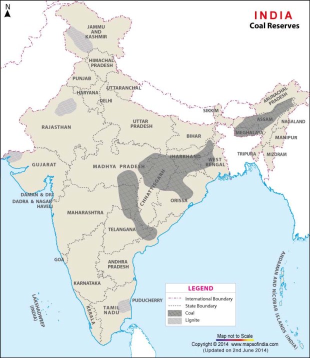
Other countries too might use coal if they decide to build military-defended mega-industrial areas. Many significant countries in the world have coal mines or coal reserves, yet do not produce natural gas or oil in as significant quantities. These include Germany, India, England, Turkey, Poland, and China, for example. Moreover, countries can build up huge stockpiles of imported coal, which they cannot do with natural gas.

coal production .png
coal production by province

105414-004-7B3E5668

A mega-industrial region of this kind, backed by the military, could perhaps also allow carbon capture and storage to finally become economically viable. Carbon capture and storage is a key component of mitigating global warming if fossil fuels are not going to be phased out, yet thus far it has been far from economical. But whereas it has not been achievable for a single power plant, if you cluster many power plants together in one area, it could maybe allow for the economy of scale necessary to make carbon capture more affordable.

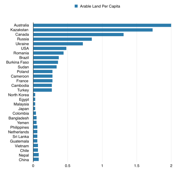
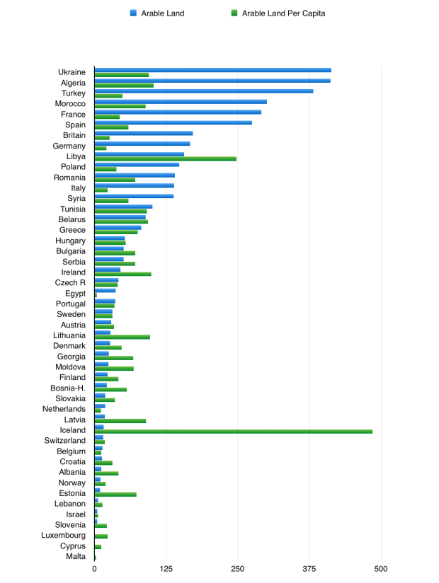
If, finally, tensions between Russia and “the West” continue to deteriorate, or if the situation in Ukraine continues to destabilize, it might lead to European countries to have to turn to imports of energy from the Americas to make up for the natural gas and coal they would have to stop importing from Russia and Ukraine. This too could help to push up the price of US coal.

Conclusion 

I am just playing devil’s advocate here, of course.  I don’t actually have any idea what the future of the American or global coal industry will be. Still, judging by the fact that the Dow Jones US coal index has nearly tripled since the start of 2016 (though it still remains around 80 percent lower than it was as recently as mid-2014), I may not be the only one to be doing this.

Investors Aloud

Hello! I’ve made a new website, investorsaloud.com. It’s a bit of a work in progress at the moment, but please check it out anyway if you are interested. I hope you like it.

All the best,
Joseph

Fasten Your Snowbelts – Technology and the Great Lakes

Outside of the Rocky Mountains, most of the snowfall in the United State falls within the Great Lakes “Snowbelts”. So too does a significant portion of the snow that falls within Canadian cities. These Snowbelts are located, almost entirely, in Michigan, upstate New York, or Ontario:

Great_Lakes_Snowbelt_EPA_fr
The Great Lake Snowbelts
US Snow Map .png
Source: USA.com; Portacup

In the map above, which shows average yearly snowfall in the more than 3000 counties of the United States, there are just 29 counties (according to my count) that receive 120+ inches of snow, 30 counties that receive 100-120 inches of snow, 50 counties that receive 80-100 inches of snow, and around 100 counties that receive 60-80 inches of snow.

13 of the 29 with 120+ inches of snow are in the Great Lakes Snowbelts (8 of the remaining 16 counties with 120+ inches of snow are in Colorado). 15 of the 30 counties with 100-120 inches of snow are in the Great Lakes Snowbelts (compared to 5 in Colorado and 5 in Vermont or Maine). 24 of the 50 counties with 80-100 inches are in the Great Lakes Snowbelts (compared to 7 in Colorado, 4 in Alaska, and 9 in Vermont, New Hampshire, or Maine). And about half of the 100 or so counties with 60-80 inches are in states which border the Great Lakes.

As you can see in the maps below, this has had a big impact on urban development within the Great Lakes basin. The largest cities, namely Chicago, Toronto, Detroit, and most of Cleveland-Akron, are located outside of the region’s snowbelts. Chicago, for example, gets only a third of the snow on average that Rochester, NY gets in any given year, and a sixth of what cities like Oswego, NY get.

great lake pop

Great_Lakes_Snowbelt_EPA_fr

average snow.png
With the exception of Sault St Marie, each of these cities has a population of at least 100,000. Sault St Marie is the quintessential Great Lakes city, however; it is located around the place where Lake Superior, Lake Huron, and Lake Michigan, the three largest great lakes, converge. It has a population of 75,000 on the Canadian side of the city and 14,000 on the US side. New York City, meanwhile, is obviously not on the Great Lakes, but I included it anyway to show as a comparison    …also, please forgive our misspelling of “Erie” on the graph above

There are, of course, some notable cities within the Great Lake Snowbelts. Buffalo, for example, which serves as New York state’s outlet on Lake Erie, was the 8th most populous city in the United States in 1900, and the 4th most populous city in the US that did not have an ocean port. (A year later, in 1901, President Mckinley was assassinated in Buffalo at the Pan-American Exposition). This was before the construction of the US’s road and rail networks stripped the Erie Canal, and thus Buffalo, of most of its economic significance. Today Buffalo is estimated to be just the 76th most populous city and the 46th most populous “urban area” in the country. It has recently had one of America’s fastest shrinking populations.

canal_map2
Erie Canal

Erie, Pennsylvania, meanwhile, was the country’s 69th most populous city in the US in 1930. Erie once served as the meeting place for three separate American railway networks, which used different gauges as one another, before these networks were standardized during the middle of the 19th century. Today Erie is not even in the top 300 most populous cities in the US and is just its 183rd most populous “urban area“. It too has a fast-shrinking population.

erie_pa

Rochester and Syracuse were the 22nd and 40th most populous cities in the US in 1930, respectively, but are now just the 103rd and 182nd most populous cities and the 60th and 90th most populous “urban areas”. Rochester and Syracuse serve as New York state’s outlets on Lake Ontario, just as Buffalo does on Lake Erie. Rochester is located 11 km inland from Lake Ontario and Syracuse 53 km inland, however, unlike some of the non-snowbelt cities on Lake Ontario like Toronto, Hamilton, and Kingston, which are situated directly on the lake.

Grand Rapids is listed as the 123rd most populous city in the US and the 70th most populous “urban area”. It is Michigan’s second largest city and serves as the state’s chief outlet on Lake Michigan. Like Syracuse, it too is located inland: it is 50 km upriver from the Lake. As you can see in the map below, Grand Rapids is the only place along Lake Michigan’s coast where the lake’s coastal lowland (the green areas on the map) extends relatively far inland.

great lakes
Note, by the way, how Lake Superior presents challenges to urban development: it is further north than the other Great Lakes, has snowbelts on both its eastern and its southern shores, and it has very narrow coastal plains overlooked by escarpments. The main Lake Superior port city of Duluth, Minnesota gets more snow (86 inches) than any other city in the state –  a lot more snow in most cases. (Minneapolis gets 54 inches). Thunder Bay, which is Canada’s primary Lake Superior outlet, gets 64 inches of snow.
average snow.png
I forgot to add Syracuse, which should be second on this list: it gets 123 inches of snow on average, according to currentresults.com.

Cleveland’s numbers on the graph above are somewhat misleading. They are skewed upward because some of Cleveland’s suburbs, like Broadview Heights, usually get much more snow than Cleveland proper does. Akron, meanwhile, gets even less than Cleveland: just 47.4 inches of snow a year. Akron gets less than half of what nearby Erie in Pennsylvania gets. Pittsburgh, by the way, gets 41.9 inches of snow a year, on average.

eerie snowbelt

Outside of the big and medium-sized Great Lakes cities, there are places in the Snowbelts that get even more snow. Lake Ontario coastal towns in the area from Oswego (population: 18, 142) to Watertown (population 27,823), get well over 100 inches of snow a year. Marquette in Michigan and Owen Sound in Ontario do too. And even smaller places like Boonville, New York (population 2056), in the foothills of the Adirondacks, and Hancock in Michigan’s Upper Peninsula (population 4596) get more than 200 inches on average. According to this source, Hancock is the snowiest city in the United States among cities or towns with at least 1000 residents, with the exception of Valdez, Alaska or Crested Butte, Colorado.

watertown to oswego
…assuming you don’t get caught in a whiteout


Why does any of this matter? 

The Great Lake Snowbelts have posed challenges for urban development thus far. Buffalo is by far the most populous snowbelt urban area, and even Buffalo is not a big city. And apart from Erie, Rochester, and Syracuse in the US or London, Barrie, and Sudbury in Ontario, there are no other Great Lake cities that get more than 70 inches of snow a year on average and have populations of at least 100,000. It simply has not made sense to grow a city in a place with so much snow.

Technology, however, could be a game-changer when it comes to dealing with snow and with snowstorms, which could in turn could give a boost to the economies – or real estate values – of this region. This is particularly relevant given that this is a region that otherwise has great assets, such as the Great Lakes and physical proximity to Manhattan, Toronto, Chicago, and other major North American cities. Indeed, even the snow itself can be an asset once its limitations can be overcome. Snowfall is not only beautiful, but also provides recreation (skiing, cross-country skiing, taboganning, etc.) and can help to prevent forest fires.

One technology that could help the Snowbelt is self-driving snowplows. It makes sense that self-driving snowplows should come into operation even before self-driving cars or trucks do, as snowplows are often in demand overnight, when few other drivers are on the road and labour costs are high. Snowplows drive and work slowly, meaning that plowing roads normally tends to be labour-intensive and that self-driving plows working overnight would probably not be as much as a safety hazard as faster self-driving cars might initially be.

Similarly, snow-clearing robots can help clear parking lots, sidewalks, and, most helpfully, rooftops. Rooftop snow can be especially damaging to buildings, and is often difficult, expensive, and time-consuming to clear.

Another technological change is e-commuting and e-commerce. If you do not want to commute to work following a heavy snowfall, you may now work from home instead, or from an office or co-working space near your house. And you may order your groceries directly to your house.

If you do not want to drive while it is snowing or has recently snowed, you may also soon be able to use an app like Uber or Uberpool to get around in a vehicle that can better handle harsh conditions.

And if you are driving, you can use tools like GPS and smarter cars to better handle snow. Today, driving in a road that does not have street lighting while it is snowing can be hugely irritating and dangerous; when you turn your headlights on the light ends up scattering off the snowflakes, making it nearly impossible to see. There is also often snow covering the surface of the road, making it difficult to see the barrier between your lane and the lane for oncoming traffic. You often have to drive extremely slowly, and even then can easily get your car stuck in a snowbank or suffer a car accident.

GPS can help you can quicker emergency response or roadside assistance. And technologists are working on tools to help cars and trucks navigate through heavy snowfall and help drivers to avoid getting into accidents when in rough, wintry conditions. Self-driving trucks travelling overnight could also help get trucks off the road during the daytime, and to save truckers the trouble and danger of having to drive through a snowstorm.

Now, a little bit more on the Snowbelt:

Nearly all the Snowbelt are in Ontario, Michigan, or upstate New York. The snowbelts in upstate New York and Eerie, Pennsylvania are strategically located at the “backdoor” to the Boston-to-Washington megacity (which you can see in the map below), and are similarly adjacent to the Toronto-to-Detroit (or, more broadly, the Montreal-to-Chicago) region.

pop dens .png
population density/major urban areas in the US

According to Accuweather, of the 10 snowiest “major” cities in the world, three are in New York state (Buffalo, Rochester, and Syracuse), three are in Canada (Saguenay in Quebec, St John’s in Newfoundland, and Quebec City), and four are in northern Japan (Sapporo, Aomori, Toyama, and Akita). Aomori gets the most by far: 312 inches, compared to second-placed Sapporo which gets “just” 191 inches.

In Canada, unlike the United States, the Great Lakes Snowbelts don’t dominate in the snowfall category, since places further north where the weather is colder often get more. French-speaking cities like Quebec City, Saguenay, and Sherbrooke, for example, get more snow than places throughout much of the Great Lake Snowbelts, mainly because they have very cold climates.

average snow in canada

St John’s, Moncton, and Cape Breton, on the other hand, which are in Canada’s Atlantic Maritime provinces, are actually relatively warm, yet still receive enormous amounts of snow. St. John’s,  which is the largest and snowiest of these three, is actually one of the warmest cities in Canada outside of British Columbia during the winter; its coldest month is February, when it averages highs of -1 degrees Celsius and lows of -9 degrees Celsius. But in return for this “balmy” winter weather St John’s also gets cooler summers than other Canadian cities: its average high in August is just 20 degrees Celsius (68 degrees Fahrenheit).

ATLSnow1_zpsagvizzh9

Finally, one last thing on Snowbelt snow patterns, from theweatherprediction.com. They can be highly erratic and different to forecast in advance:

“Lake-effect snow has been a forecaster’s nightmare from when maps were drawn by hand to the current days of computer predicted models. But no one computer can accurately predict the magnitude or severity of a lake- effect event with the same success as a synoptic event. To describe lake effect snow as temperamental would be a gross understatement. Often arranging itself in rogue bands of heavy snow, lake- effect can stop and start on a dime, and it can dump a foot of snow on one neighborhood and leave the residents of another wondering why the idiot meteorologist keeps breaking into Oprah about some kind of Lake Effect Snow Warning.

And in its unpredictable nature comes its beauty. One of natures precious wintertime treats, just the prospect of lake- effect snow strikes both fear and awe in the hearts of a forecaster. There are, however, trends. Subtle nuances that fade in the background to the untrained eye, but trends nonetheless. If nothing else, these trends offer a faint possibility that maybe, just maybe, Mother Nature may be following a game plan all along.

…Conditions [for lake-effect snow to form] are so difficult to achieve in one given place that lake effect only occurs in four locations on the entire planet: the southeast shoreline of the Hudson Bay, areas just east of the Great Salt Lake in Utah, the northernmost Japanese island of Hokkaido, and of course, the Great Lakes.

Lake snows generate downwind of the Lakes. Sure, lots of people live near a Great Lake, but only a few lucky ones live downwind. Downwind though, is very much a relative term. One day, it takes a west wind. Another, a north wind. But that’s just one piece of the puzzle. Pace yourself. Meteorology follows from this point on.Read more here.


lake effect
Lake effect snow storm coats car in ice. Yikes.


The Return of the Atlantic

This article was written for an essay contest, so the style is a little bit different from others on this site. It was first written three years ago, when most people had not yet become bearish on the Chinese economy and politicians in the US were still talking a lot about America’s “pivot to Asia”. The essay discusses the possibility that the Atlantic regions – North America, South America, Europe, and much of Africa – will remain at the heart of the international system in the years and decades to come, for better or for worse.

Hope you like it!

Atlantic_Ocean_laea_relief_location_map

The Return of the Atlantic 

For nearly 500 years, the Atlantic Ocean was the unrivalled centre of the international system, connecting Europe to its expansive economic and imperial networks in Africa, Asia and the Americas. Transatlantic trade continued to exceed transpacific trade as recently as the late 1980s, while at the same time the transatlantic alliance against the Soviet Union remained the world’s most important geopolitical partnership. Indeed it seems incredible to recall now, but China, India, Indonesia, Korea, and Australia combined had a smaller economic output than West Germany in 1990.

Today, in contrast, the European Union and United States both import more goods from China alone than they do from one another, and the Cold War has been over for a quarter of a century. The Pacific has in many ways become the new centre of the world: it is home to the three largest economies of America, China, and Japan, is the highway for East Asian imports of commodities and exports of manufactured goods, and acts as a base for nearly 75 percent of US soldiers stationed outside of North America or Afghanistan. Not surprisingly, a majority of economists, politicians, and journalists believe that the continued economic growth of populous Asian countries like China, India, and Indonesia means that the centrality of the Pacific has only just begun.

In this essay we will argue that, even as it remains popular to herald the arrival of a “Pacific Century” (to quote a famous Hillary Clinton op-ed in Foreign Policy magazine), it will actually be the Atlantic that will become once again the centre of the international system, serving as the corridor of an expanding economic network that will incorporate Europe, the Americas, much of Africa, and to a lesser extent even parts of southern Asia. Transatlantic commerce is likely to once again exceed the value of transpacific commerce and, partly by doing so, it will help to serve as an organizing force in global geopolitics. We hope it will serve as a force for good in the world as well.

To be sure, while we view this Atlantic phenomenon as likely to be brought about by economic, cultural, and linguistic circumstances that are already actively or latently in place, we will also argue that, from a policy perspective, the political effectiveness and ethical utility of such a reinvigorated transatlantic relationship will depend on the extent to which efforts are made to reduce carbon emissions in developed economies, as well as on the extent to which efforts are made to provide honest and constructive assistance to struggling countries within the developing world.

The Pacific Moment

The rise of transpacific trade during the latter half of the 20th century occurred as a result of a unique set of circumstances. These were, specifically, the reconstruction of the Japanese economy following its destruction in the Second World War, the emergence of South Korea and Taiwan following their adoption by the United States as strategically-located allies in 1950, and the rapid growth of coastal Chinese states following their devastation during the Sino-Japanese War, Chinese Civil War, and isolationist era under Mao, which occurred in an overlapping succession from 1927 until 1979. These four countries have caused transpacific commerce to soar in recent decades, with help from Southeast Asian success stories like Singapore, Thailand, and Malaysia.

While this rising transpacific trade has certainly deserved the widespread public attention it has received, it has nevertheless served to overshadow a number of other key characteristics of the global economy, which instead highlight the enduring significance of the Atlantic Ocean. These include the fact that roughly 65 percent of both the world’s nominal economic output and private consumer spending are located in the Atlantic basin rather than in the Pacific basin; that more than 70 percent of the populations of North America, South America, and Sub-Saharan Africa live within the Atlantic basin rather than the Pacific basin; that the Pacific generally takes 2-4 times longer to cross widthwise by ship than the Atlantic does; that the quantity of transatlantic investment is estimated to be 5-10 times greater than transpacific investment; and that Indian and Pakistani trade and labour crosses the Atlantic, Mediterranean, or Arabian Sea far more often they do the Pacific.

The reemergence of transatlantic interactivity as a defining feature of the international system will simply reflect these enduring realities. In addition, it will be driven by a set of economic evolutions that are beginning to revive transatlantic trade relative to transpacific trade, as well as by the continued spread of modern communications and the emergence of African and Latin American economies, which are helping to increase the political and economic significance of the cultural, social, and linguistic affiliations that bind together the four continents of the Atlantic world.

ocean-drainage-basins

Transatlantic Connections

Atlantic regions share a number of important connections with one another. The first is cultural: unlike in Asia, the overwhelming majority of people in the Americas are of European or African heritage. Most have ancestors that arrived within just the past century or two. This could have increasingly powerful political and economic consequences in the future, particularly as the economies of Africa develop and as African populations in the Americas become wealthier and more empowered (most notably the 40 million US African-Americans, 28 million Afro- Caribbeans, 15 million Afro-Brazilians, and 80 million Brazilians who identify as being of mixed ancestry), such that it will no longer just be white Americans and Europeans engaged in the most significant transatlantic partnerships.

The second transatlantic connection is a social one, the result of technology increasingly allowing first-, second-, and even third-generation immigrants in the developed world to maintain relationships with family members, friends, and acquaintances back in their countries of origin. Crucially, immigrants in North America and Europe come overwhelmingly from Latin America, Sub-Saharan Africa, or the Mediterranean basin. More than half of the foreign-born population in the United States arrived from Latin America alone, and there are about four times as many first-generation immigrants in the European Union from Africa or the Americas as there are from East Asia.

There are, in fact, already 2-3 million Latino-Americans living in Spain, and more than 50 million living in the United States. Africa’s emigration rate to both Europe and North America, meanwhile, has risen at a faster pace than that of any other region since 1980, and is likely to continue to do so as a result of the fact that the average birth rate in Sub-Saharan Africa is nearly twice as high, and the per capita income nearly twice as low, as that of any other part of the world.

Finally, and in our opinion most importantly, there are the transatlantic linguistic connections. Over 80 percent of the world’s nearly 1.5 billion native speakers of Spanish, English, French, Portuguese, or Arabic live within the Atlantic or Mediterranean basins; each of these languages is fairly prominent within at least three separate continents. English, moreover, is far more widespread in mainland Europe than it is in any other continent apart from North America (or Australia). Switzerland, Germany, Austria, Scandinavia, the Netherlands, and Belgium are particularly proficient; according to some estimates, 60-90 percent of their populations are able to speak English In France, Italy, and Poland, meanwhile, the share of English speakers is estimated at 30-40 percent, which is still far ahead of countries like China, Japan, Indonesia, and even India.

In Africa, European languages are also spoken more widely than in most other areas of the world. This is partially the result of to the continent’s colonial histories, many of which ended as recently as the 1960’s or 1970’s. It is, however, also the result of Sub-Saharan countries tending to be linguistically diverse, such that their use of European languages as lingua franca remains common practice. Indeed, despite having the world’s lowest density of accessible schools, televisions, computers, and satellite dishes, English is already spoken by a greater number of people in Africa than in more populous India, both as a native language and as a secondary one.

French, meanwhile, is used by an estimated 90 million Africans, Portuguese by an estimated 20 million Africans, and Arabic as far south as the Sahel.24 In South Africa approximately 20 million people understand Afrikaans, a language that is for the most part mutually intelligible with Dutch. Over 85 percent of Africa’s English-speaking population and nearly all of Africa’s French-, Portuguese-, Arabic-, and Afrikaans-speaking populations live within the Atlantic or Mediterranean basins.

Also important is that over 40 percent of Africa’s population is under the age of fifteen. This makes it the world’s youngest region by a considerable margin: by comparison, only 15 percent of China’s population and 29 percent of India’s population are younger than fifteen. Children possess the ability to learn languages many times more easily than adults can, particularly if they have access to schooling, books, media, and modern communications.

Africa’s current generation of children might become the first to grow up with widespread access to such tools, which might therefore help African economies to develop and integrate with the other continents of the Atlantic world. This is also one reason why it would be wise from a policy standpoint for Europe and North America to immediately support economic development in Africa, since doing so would help African populations gain access to more education and information now while they are still young.

Shifting Trade Patterns

In 2013, Chinese coastal cities had an average nominal per capita income of roughly $20,000, nearly as high as those of South Korea and Taiwan. The median age in China is 37, about the same as in the US; in South Korea and Taiwan the median age is 40. These are no longer really “emerging markets”, in other words. Rather than experience another lengthy period of rapid economic growth that would continue to drive up transpacific trade, they will instead be undergoing various structural evolutions, as all maturing economies tend to do over time.

In the coastal areas of China, this evolution is likely to be from an economy oriented around exports of lower-end manufactured goods to an economy that exports value-added goods and services and is more reliant on the private consumption of its own population. Such shifts are natural for a middle-income economy like China to experience, but they may also reduce the quantity of China’s transpacific imports of industrial commodities and transpacific exports of manufactured goods.

Economic growth in the poorer interior provinces of China, meanwhile, or in the even poorer Indian subcontinent, is not certain to bring about the continued rise of transpacific commerce either. The emerging provinces of the populous Chinese interior are likely to trade mainly with coastal Chinese provinces and other countries in Asia, rather than with economies overseas. Today, for instance, in Sichuan and Henan, the two largest inland Chinese provinces, exports account for around just 4 percent of provincial economic output, almost nothing compared to the 47 percent of economic output that exports account for in coastal China’s two largest provinces, Guangdong and Jiangsu.

In addition, given the crowdedness of China’s coastal cities and ports, the interior provinces of China may also increasingly avoid using the Pacific in favour of the more direct “Silk Road” routes to Europe, or in favour of using Myanmar’s commercially navigable Irrawaddy River to directly access the Indian Ocean.The economic emergence of the Indian subcontinent, meanwhile, could perhaps lead transatlantic commerce to rise faster than transpacific trade, as India and its neighbours may partially succeed China in supplying cheap goods or services to consumers in the Atlantic world.

As they emerge, the Indian subcontinent and the Chinese interior will also be importing rapidly growing quantities of oil and gas from the the Persian Gulf, Central Asia, and Russia. Indeed, India and Pakistan already receive roughly 75 percent of their oil and gas imports and an astonishing 30 percent of their imports of goods in general from the Persian Gulf. China’s interior provinces, meanwhile, get around 75 percent of their gas imports from Turkmenistan and Uzbekistan and 30 percent of their oil imports from Russia and Kazakhstan. These imports are likely to increase, not only because of India’s and China’s continued growth, but also because of their shared desire to consume less coal, on which they rely for an average of about 65 percent of their energy consumption.

This need to import large quantities of energy could lead to competition, rather than cooperation, between regional powers like China, India, and Japan, potentially undermining Asia’s ability to cooperate as a more coherent political unit. (In contrast, the Atlantic world consists mainly of synergistic relationships where energy is concerned: Europe is a net energy importer, South America and Africa are net energy exporters, and North America is not too far from reaching the “energy independence” it has long dreamed about). Moreover, because the European Union itself currently receives around 60 percent of its oil and gas imports from Russia, the Persian Gulf, or Central Asia, the increasing energy consumption of Asia may force Europe to begin importing much more energy from the Americas or western Africa instead, further boosting transatlantic trade.

Conclusion: Policy Framework

While the renewed significance of the Atlantic is likely to occur mainly as a result of the commercial, cultural, social, and linguistic factors discussed above, we believe that specific policy goals are nevertheless required to ensure that such a renewal occurs in a manner that is both ethical and politically effective on a global level. Two policies in particular may be advisable in this regard:

One is the implementation of per capita carbon emissions taxes. Such taxes would likely facilitate transatlantic commerce through the export of European energy-saving and clean energy production technologies to the emissions-intensive markets of North America, whilst simultaneously providing both Europe and America with a more responsible and defensible platform in climate treaty negotiations with industrialized Asian economies that have much lower per capita and historical emissions levels.

The other is increasing political outreach and economic assistance to struggling countries, particularly those within Africa. Africa contains many of the world’s greatest challenges if it is not constructively engaged with, and it also has a youthful and diverse population of more than a billion people, vast reserves of natural resources, and linguistic and social connections with Europe and the Americas. All of these qualities make it a necessary component of any revitalized transatlantic project.

Of course, each of these policies deserves much more focus than we have left to spare in this essay. Yet still we feel confident in saying that, if these two policies are diligently and honestly pursued, then the unexpected return of the Atlantic as the central corridor of the international system would not only become more likely to occur, but will also be much more welcome when it does.

Examining China’s M&A Boom

An article in last week’s issue of The Economist showed that China’s outbound M&A activity[1] has risen sharply of late, up approximately fivefold since the summer of 2015 and eightfold above its average rate between 2010-2015.[2]

The article mentions that this increase could represent a troubling trend of capital fleeing China in response to China’s experiencing slowing economic growth and a gradually depreciating currency in recent years.

It then largely dismisses this theory, however, saying, “rather than sparking a stampede [of money] to the exits, it is more accurate to say that these changes [in China’s economic performance] have alerted Chinese firms to the fact that they are still woefully under-invested abroad. China’s share of cross-border M&A has averaged roughly 6% over the past five years, despite the fact that it accounts for nearly 15% of global GDP[3]”.

Implicit in these words is the expectation that a country’s share of global M&A should not be too different from its share of global GDP. Yet this overlooks several other factors that may determine a country’s propensity for engaging in M&A. These may include a country’s role in international trade, or a country’s proximity to other large economies or foreign financial hubs, or a country’s cultural and linguistic affinity[4] or political relationship with other large economies and foreign financial hubs.

China ticks each of these boxes in a notable way. It is both physically and linguistically isolated from most of the global economy beyond its own borders: East Asia outside of mainland[5] China accounts for only 12% or so of world GDP[6], while the combined GDP of the world’s majority-Chinese economies outside of mainland China is about nine times smaller than that of mainland China itself[7].

China’s political relations are somewhat fraught. 45% of East Asia’s GDP outside of mainland China occurs in China’s regional rival Japan[8], nearly half of the world’s GDP that occurs in majority-Chinese countries outside of mainland China itself occurs in Beijing’s rival Taiwan, and 25% of global GDP is from its potential rival superpower the US[9]. 

China’s propensity toward international trade is, similarly, not pronounced[10]. China accounts for an estimated 11% of international trade, compared to 15% of global GDP.

Finally, apart from Taiwan, the only notable majority-Chinese economies outside of mainland China are business-financial hubs: Singapore and Hong Kong. Such hubs historically tend towards very high M&A activity, and towards being net originators rather than targets of M&A deals[11]. China’s global share of outbound M&A might therefore be higher were these not financial hubs. If, for example, Hong Kong was considered to be part of mainland China[12], China’s outbound M&A would in most years have been meaningfully higher than it has been[13]. 

The value of China’s outbound M&A as a share of global cross-border M&A should perhaps be lower than China’s share of global GDP, then. Yet so far in 2016 it is on pace to be much higher than China’s share of global GDP. The M&A boom could be capital flight after all. 

————

NOTES:

1 — Specifically, the “value of announced outbound mergers and acquisitions including net debt of targets”, according to the article. Notably, however, “announcing deals is not the same as closing them. Between losing out to other bidders and rejection by regulators, China’s investment tally could fall [below what it has announced].” “Nevertheless”, it goes on, “the trend is unmistakable. In recent years China has consistently accounted for less than a tenth of announced cross-border M&A deals; this year its share is nearly a third.”

2According to this article in the Financial Times, Chinese buyers account for an estimated 15% of the value of cross-border M&A that has occured thus far in 2016”. The Chinese offer to buy the Swiss company Syngenta, if accepted, is roughly big enough to eclipse all outbound chinese M&A in any year before 2014.

3- The article goes on to say “…Strategic considerations—acquiring technology and brands that China lacks—are more important [than moving capital out of China] for buyers [of foreign companies], both to bolster their position at home and to speed expansion abroad.”

4 – The following quote is from Clifford Chance and the Economist Intelligence Unit, from 2012: “Despite the growing need for companies to invest in new markets in order to realise their growth ambitions, more than one-half say that they are discouraged from acquiring overseas because of concerns about bridging cultural differences. This rises to 63% for respondents in the US. Many companies admit that they find the softer side of deal-making challenging, with just 44% of companies saying that they are effective at handling cultural integration as part of the transaction process.”

5 — “Mainland China” in this case does not include Hong Kong, Macao, or Taiwan, but does include other Chinese islands like Hainan and Xiamen.

6 – If you also include India, Australia, and New Zealand this figure rises to 18%

7 -By comparison, even the nominal GDP of the United States is only 2.75 times larger than the combined GDP of Britain, Canada, and Australia. France’s GDP is only 3.15 times larger than that of Belgium plus Quebec. Even if you try to count the wealth of the entire Chinese global diaspora rather than just majority-Chinese economies like Taiwan, Hong Kong, and Singapore, it is still very small compared to the size of mainland China’s GDP.  If you assume, for simplicity’s sake, that there are 50 million “overseas Chinese” (the figure given, roughly, by Wikipedia), and that each has an average income of $25,000 (similar to the per capita GDP of Taiwan), then the overall income of the Chinese diaspora is $1.25 trillion — still little more than 10% of mainland China’s GDP.

8 – According to this source, “Chinese FDI in Japan and trade relations between the countries have a long history because of the relative cultural and geographic proximity between the countries (Alvstam et al., 2009). Also, China is one of the two most important trade partners for the Japanese economy. All this should, following the mainstream trade theories (e.g., Helpman, 1984; Helpman & Krugman, 1985; Petri, 1994), give favorable conditions for large inflows of FDI. In relative terms, this picture has to some extent been correct. Before the recent territorial row over the Senkaku, or Diaoyutai, Islands located between Okinawa and Taiwan, the Chinese and Japanese mutual cross-border M&As was steadily increasing with 2010 and 2011 as peak years recording 16 M&A deals, respectively (Recof, 2012). However, this trend seems to have been broken, by recording only 6 M&As in 2012, and 5 M&As in 2013.”

Japan was not even one of China’s top 10 targets of outbound M&A between 2005-2015— the biggest target for outbound Chinese and Hong Kong M&A was Britain (14.6% of the total). By comparison, 43.7% of Japan’s outbound M&A over the past 10 years went to the US. (Source: graphs from http://qz.com/465638/charts-and-maps-how-japans-companies-are-beating-chinas-in-overseas-ma/)

9- This is not to say the China’s relationships with Japan, Taiwan, or the US are nearly as troubled as many people think they are or would like them to be. Still, these relationships mean that China may have a very different outlook in foreign affairs than do many other countries.

10 – Indeed, one might expect China to account for a disproportionately large share of international trade, given its role as the ‘workshop of the world’ and its voracious appetite for imports of energy and minerals. But in fact China only accounts for about 11-12% of global trade as far as I can tell (using statistics from MIT’s Observatory of Economic Complexity), regardless of whether or not Hong Kong is included.

11-   In 2014, the largest M&A deal involving an Asian country, whether cross-border or domestic, was the acquisition of China’s CITIC Ltd. by Hong Kong’s CITIC Pacific Ltd., a deal that was worth about three times more than any other involving an Asian country that year. In 2015, in contrast, one of the biggest deals was, according to this article from Bloomberg, “China Cinda Asset Management’s (pending) $8.8 billion purchase of Hong Kong lender Nanyang Commercial Bank.” Singapore’s outbound M&A has been increasing by a huge amount in recent years too and is much higher than its inbound M&A.

12 —M&A statistics, moreso than many other economic or financial categories, tend to consider Hong Kong as being separate from the rest of the territories of the People’s Republic of China. This may be (at least partially) justified, but it can also confuse matters at times.

13 – In 2011, 2012, and 2013, Hong Kong’s outbound M&A was about 25-40% as large as mainland China’s, even though Hong Kong’s GDP is only around 2% as large as mainland China’s. Singapore’s outbound M&A, meanwhile, was 1.5-22% as large as mainland China’s during 2011, 2012, and 2013, while Singapore’s GDP was also only about 2% as large as mainland China’s.  (Source: Global Financehttps://www.gfmag.com/global-data/economic-data/value-of-cross-border-maa-by-region-country?page=2)

M&A Table

I made this chart in order to find correlations between outbound M&A activity (as given in column I, at the right end of the chart) and the factors in the four leftmost columns of the chart. Column I’s closest linear relationships are with columns E and F — though Japan is an outlier in both cases. Admittedly, though, this chart does not include enough countries or enough years of M&A to say much.

Column B is based on the regions Europe, North America, and East Asia. For example, the USA’s figure in column B is equal to the GDP of Canada plus the GDP of Mexico divided by the GDP of the world. Column C is based on two “super-regions”: the North Atlantic (including Europe and North America) and the Indo-Pacific. The US scores much lower than China in Column B – because North America minus the US has a much smaller GDP than East Asia minus China – but scores much higher than China in Column C, because the US is not far from Europe.

Column D is based on countries in which the majority language(s) is the same: China’s figure in column D, for example, is equal to the combined GDP of Taiwan, Hong Kong, and Singapore – the only other majority-Chinese economies – divided by the GDP of the world.

Guest Post: Political Turnover Rate in the US

Here’s a guest post from VacuousWastrel, which I enjoyed reading. Hope you like it too.

Political Turnover Rate in the United States 

America is, like a lot of democracies, a two-party country, more or less. There’s one party, and then there’s the other party, and people tend to consistently vote for one or for the other and that’s just how it is and always has been. Nothing special there. As I say, it’s common. It reflects in part the simple plurality (or ‘first past the post’) electoral system, which privileges the two largest parties, but also to a large extent the social cleavages within the nation.

That’s why most countries (not all, but most) with multi-party systems in practice tend most of the time have those parties line up in two blocs – one of the left, and one of the right, although in individual countries local issues may also play a role in defining how the blocs see themselves, and how they compete. [Long-term additional parties or blocs likewise tend to reflect additional cleavages – regional parties that reflect differences in national or ethnic identity, for example]

As a result of parties being based on underlying cleavages, parties tend to be static: the same people, and the same places, keep on voting for the same parties, or their successor parties. There are parts of the UK that have voted Conservative (or, before that, Tory) every election since the 1830s.

But parties aren’t fixed in stone, and the biggest example of that is the US (perhaps in part because historically both major parties were broadly ‘liberal’ middle-class parties, more flexible than the labour parties, agrarian parties or religious parties, or even conservative parties, found in most other democracies). It’s well known that the US has gone through several different ‘party systems’, in which its parties had different names, or drew from different bases of support, or competed on very different issues. What that means on the ground is that areas have gone from supporting one party to supporting another.

And that, excuse the longwindedness, is what I’ve just been intrigued by. How far do you have to go back before all the states in the US voted differently from how they do now? How often has such a complete turnover occurred? How quickly does it occur?

This isn’t an academic study, it’s just me looking at some historical election results. There are ambiguities around the edges, mostly around how you define which parties are the successors to which earlier parties – I’ve taken an inclusive, common sense line on succession, because I’m interested in real changes in voting, not just party rebrandings. And for my purposes here, I’m defining a “turnover” or “transition” as a period of time from Year X to Year Y, inclusive, when every state had been admitted to the union by Year X had voted for two different parties by Year Y – which means that during that time, no states (other than those that entered the union during that period) remained loyal to a single party. And the turnovers that have occurred are:


1: 1789 – 1820: the Connecticut / Delaware Transition

This one is nice and clear cut: in 1789, every single state voted for Washington’s Federalists; in 1820, every single state voted for Monroe’s Democratic-Republicans. I’ve called this the Connecticut/Delaware Transition, because those are the only two states that didn’t vote D-R in 1804 – the country was, as it were, kept waiting for those two states to switch allegiance. Because these transition periods are about both change and continuity: change in that across the period all states changed their votes, but continuity because they are defined by the end of a state’s loyalty – in this case, Connecticut and Delaware voted Federalist every election up to, but not including, 1820. This example turns out to be commonplace: often transitions revolve around a big wave election like 1804, with just a few loyal states that are then picked off more slowly later on.


2: 1796 – 1860: the Virginia Transition

The one-party state established during the C/D Transition eventually broke down. And by ‘eventually’, I mean the very next election, in 1824, when four different candidates ran, all nominally as Democratic-Republicans – the two new parties, the Democrats and the National Republicans, were only formalised for the 1828 cycle. I’ve chosen to consider the Democrats as the successor party to the D-Rs – the Democrat Jackson was the candidate with the most votes in 1828 (though he lost the election when the House settled on his rival, John Quincy Adams, instead), and the self-declared ‘Old Republicans’, who wanted to restore the perceived traditional values of the party, eventually sided with the Democrats, rather than with the National Republicans.

This transition therefore represents the loss of dominance by the D-R/Democratic Party and the rise of a sequence of new parties – National Republicans, Whigs, and finally Republicans. Virginia was the final hold-out, voting the same way for 64 years, before finally voting for the Constitutional Union Party on the eve of the civil war – it would take until 1872 before they finally went the whole way and voted Republican.


3: 1820-1868: the Alabama Transition

This transition can be seen as an extension of the second: it exists because several states entered the union after 1796, including a couple that would prove faithfully Democratic for decades: Missouri and Alabama. Missouri finally voted Republican in 1864, when Alabama was in secession; Alabama joined it the next cycle. The period represents the transition to a Republican-dominant system after the civil war.


4: 1828 – 1912: the Massachusetts Transition

The third transition may have left the Republicans dominant, but the Democrats were able to recover, and even to pick off traditionally Republican states. The transition ended with the unusual election of 1912: with the Republicans split into two parties, the Democrats under Wilson were able to make sweeping gains, including finally grabbing the Republican stronghold of Massachusetts, which had voted Republican (and before that Whig, and before that National Republican, and before that for the Adams faction) since 1828.


5: 1836 – 1964: the Vermont Transition

In the middle of the 20th century, power swung dramatically backward and forward, with the Democrats scoring crushing victories in 1932 and 1936, and Republicans doing likewise in 1928, 1952, and 1956. But each wave broke against the shores of the same enemy strongholds: the Democrat south and the Republican northeast. The final breakthrough didn’t come until LBJ’s sweeping victory in 1964, which finally knocked out the Republicans everywhere except, ironically, the south, and Arizona.

In the short term, the shift of the southern states to the Republicans looked more striking – but the southern states had already all voted Republican before, mostly in the aftermath of the civil war. The real hold-out was Vermont, which had been loyal to the Republicans (etc) since 1836. Remarkably, the only reason which this transition was so ‘short’ was that Vermont in 1832 had voted for the Anti-Masonic Party – the state had never actually voted Democrat before.


6: 1876 – 1968: the Arkansas Transition

Here’s the one that symbolises the loss of the Democrat south. After the initial post-civil-war confusion, the south went back to being soundly Democrat until the time of LBJ. Many southern states flipped in 1964, but Arkansas lasted until 1968, when it voted for Wallace’s American Independents. It went the whole way and voted Republican in 1972, not quite making it to the century mark…


7: 1952 – 1996: the Arizona Transition

While all that business with the south and the northeast was going on, something else had changed: Arizona, which had swung to the Democrats with FDR, swung back in the high-water Republican election of 1952. It wasn’t pried out of their hands again until Clinton’s re-election in 1996 (and that was a one-off). It’s actually a slightly bigger deal than it might seem: the most loyal of Eisenhower’s states in the far west (that is, the only one not to vote for Johnson in ’64), even its temporary loss is emblematic of the gradual transition of those Eisenhower states from Republican to Democrat: Washington and Oregon switched in ’88, California in ’92, and Nevada, Colorado and New Mexico have all become active states again. Montana and Arizona have both toyed with the Democrats, leaving only Utah and Idaho as loyal Eisenhower states (since ’64). And I guess Wyoming.


8: 1968 – ? : the Western Transition

We don’t know how long this transition will last, but I’m guessing it may take a while. The interesting thing is that the Republican stronghold this time (and this transition will be a matter of eroding Republican support – the current Democratic strongholds weren’t established until later) isn’t, in historical terms at least, the South at all, despite popular perception. The Southern states have already betrayed the Republicans: en masse to vote for Carter, and then piecemeal to vote for Clinton.

Instead, the historical core of Republican support in this transition has been in the west: the Wilkie states (that emerged as a bloc voting for Wilkie and then Dewey against Roosevelt and Truman) of Kansas, Nebraska, and North and South Dakota, plus the remaining Eisenhower states of Utah, Idaho and Wyoming. Plus Oklahoma, which also swung with Eisenhower but doesn’t really fit. Plus Alaska, which didn’t vote until 1960, but can probably be considered an Eisenhower state. All nine states went Democrat for Johnson in ’64, but switched back in ’68 and have never looked back. Not until all nine have voted Democrat at least once will the current transition be complete.


Note: due to the way these transitions are calculated, for each starting year after one of the years listed above, there is a complete turnover by the end-point of the last-listed transition. Put plainly: the 1789 and 1792 situations were both completely turned over by 1820; the 1796, 1800, 1804, 1808, 1812 and 1816 situations were all turned over by 1860; 1820 and 1824 were both turned over by 1868; the elections from 1828 to 1836 were all turned over by 1912, and so on. And conversely, because the current unfinished cycle began in 1968, that means that 1964 is the most recent election outside this cycle – that is, since 1964 every state has voted both ways, but that is not the case since 1968.

From this we can calculate the slowest and quickest turnovers. The electoral map in 1836 was not completely overturned until 1964, a record 128 years of relative stability [other strongholds during this time included Alabama and Mississippi (minus some Reconstruction-era elections) and Georgia (minus a flirtation with the Whigs in the 1840s) for the Democrats, and Maine (again, minus some confusion in the 1840s) for the Whigs/Republicans]. At the other end of the spectrum, the quickest total turnover was between 1948 and 1968 – specifically, only 5 states didn’t vote the opposite way in 1956 and 1964, and two of those (West Virginia and Kentucky) flipped twice those eight years (the only three that stayed loyal through that crisis were North Carolina and Arkansas for the Democrats and Arizona for the Republicans). Three turnovers of less than 20 years were only narrowly avoided: only one state (Arizona) voted the same way for every election from 1956 to 1968, and only two states (Arizona and Massachusetts) voted the same way in 1964-1972.


Anyway, cut out some smaller overlapping transitions and this method gives you three grand cycles: 1789-1820; 1824-1872; 1872-1964; 1968-now. This takes us back to the beginning of this post, because those line up fairly decently with the 1st, 2nd, 3rd/4th/5th and 6th party systems (though this model has the 3rd starting a little later, once the system really gets fixed in place, rather than when the Republican Party is officially founded). Interestingly, the normal debate is about whether the 5th and 6th are really separate (and if so when the break occurred), whereas under these definitions that distinction is unavoidable, and the questions are really about the 3rd, 4th and 5th systems…


Europe’s Mountain Lands — Image of the Day

mountains in europe.png

I’ve made some graphs about Europe’s mountains, using data from this thorough report made by the European Union:

mountain areas

This graph above shows, approximately, the size of European countries’ mountainous areas (in the y axis) and how big their mountainous areas are as a share of their overall territories (in the x-axis). With the exception of Slovenia, the graph does not include any of the mountainous countries of the former Yugoslavia, since the report does not mention those countries. Nor does it mention Morocco, Turkey, Russia, Ukraine, or some of Europe’s other peripheral non-EU countries. Norway, though, which is not in the EU either, is included in the report, and as you can see it is by far the biggest outlier on the graph above.

Mountain Areas - 2

This graph above shows that, as one might expect, there is a strong correlation between how mountainous a European country is and how much of its population lives in mountainous areas. Switzerland leads in both categories, followed by Norway, Slovenia, Greece, and Austria.

Mountain Areas 3.png

In this graph above the main outliers are Italy and Spain, which have by far the largest populations living in mountainous areas. Had Turkey, Morocco, and Algeria been included, however, they would have been even further ahead of Italy and its 18 million people living in mountain areas.

m area 1.png

m area 2.png

mount pop .png

m pop 2.png


Forest and Farm — Image of the Day

Using data from the World Bank , here are the top 15 and bottom 15 countries in terms of per capita arable land, among countries in which at least 15 million people live:

arable land per capita -2

Here’s zooming in on the bottom 15:

arable per capita 3
(rounded to the nearest decimal point)

Using data from Nationmaster (from 2005, so it may be outdated in some cases), here are the top 15 and bottom 15 countries in terms of per capita forest area, among countries in which at least 15 million people live:

forest area per capita

And zooming in:

forest per capita 2 .png

If these numbers are correct, then Canada has 43.7 times more arable land per capita and 10,667 times more forest area per capita than Egypt does.


Bricks, Mortar, and Wireless Headphones

greece.png

Today, at the launch of the iPhone 7, Apple CEO Tim Cook announced that the phone will not have an outlet for headphones. Customers will either have to use wireless Bluetooth headphones, or else buy a special pair of headphones that is capable of plugging into the outlet for the phone’s charger.

If the wireless headphone age really is about to get underway, many unforeseen consequences are likely to accompany it in the coming years. One industry that might, perhaps, be hit very hard by wireless headphones is the movie theatre business. While on the one hand it might be the case that wireless headphones could make going to the theatre more enjoyable – you no longer have to listen to other people smack popcorn or  whisper to one another noisily – on the other hand it could lead to vastly increased competition for movie theatres, as it could allow new movie theatres to pop up in unexpected places.

Let’s quickly look at two places this competition could arise from: sports bars and brick-and-mortar retail stores.

Sports bars could be a threat to matinées. Sports bars already have lots of big screen televisions, and in some cases very big projector screens, and in many cases comfy seats as well. They also have food and drink, and operate well under capacity during the daytime. Many also have basements or back-rooms with no windows, which can be made pitch-black even in the daytime. Some may try to turn themselves basically into little movie theatres during the day.

(Sports bars could maybe also be a threat to cable tv. One reason many people have been sticking with cable tv insted of “unplugging” and just using the Internet is to watch sports. Wireless headphones could make watching sports at a sports bar a more appealing alternative than it has been up until now, however, by shutting out other noise from the bar so that fans do not have to watch the game on mute while listening to loud drunk people around them. Now if only they could do something about those filthy bar bathrooms..)

The same is true of restaurants, though they do not have as many tv’s or as big tv’s as sports bars do, and though there are many restaurants that will certainly not want people coming in to watch sports or movies. Still, it is easy to imagine some of the less fancy restaurants trying to do this to entice customers.

The big move, however, could be at brick-and-mortar stores. These stores, even for giants like Walmart, are right now under severe threat from the online retailers, led by Amazon. It may not be long before even the grocery stores are under the same threat. These stores are desperately looking for ways to get customers to come to their stores — a desperation that is only going to increase in the years ahead.

One option they may have to attract customers is to put big movie screens in their parking lots or even inside their stores. In their parking lots, these could play movies at night when the lot is mostly empty of cars, or they could become a drive-in theatre. The screens could be put inside tents that could be easy to put up and take down, in order to block out light pollution and rain, or they could be used without tents. Given that parking lots will often be empty as more people turn to online shopping, they could have lots of room to do this.

The bigger brick-and-mortar retailers could do a similar thing inside their stores as well, which would be useful when the weather is bad and would block out light pollution. At the very least, they could allow their tv departments to play movies that children could watch while their parents shop. At the most, they could basically set-up movie theatres inside their stores, making use of wireless headphones to do so. In fact, just like how they are likely to have fewer cars in their parking lots as a result of online shopping, they are also likely to have more room inside their stores, as more of their own customers buy goods from them online and then swing by the store just to pick up what they have purchased.

And maybe to watch a movie, too.

With all this in mind, I do not think I would invest in a movie theatre company stock, like CNK, right now. If on the other hand you have any ideas of why people might instead go to the theatres more in the future, I would like to hear them, so please leave a comment about it below.


Arable Land in Europe — Image of the Day

Arable land, in and around Europe:

Arable Land Stats in and around Europe
From the World Bank: “Arable land (hectares per person) includes land defined by the FAO as land under temporary crops (double-cropped areas are counted once), temporary meadows for mowing or for pasture, land under market or kitchen gardens, and land temporarily fallow. Land abandoned as a result of shifting cultivation is excluded.”

Arable land per capita

Of course, not all arable land is of equal value.

Here’s zooming in on the lower half of the graph:

arable land per capita zooming in

These graphs could be incorrect, though. The data used to make them came from this source (which does not show per capita stats), which seems to have come in turn from the World Bank. But if you look at more recent per capita World Bank data presented here you will see that, although the order of countries is generally pretty similar to graphs shown above, countries like Iceland, Libya, Algeria, and Ireland are no longer at the top.